I am out of the office until 12/4/79.
Please feel free to contact me, and I'll get back to you upon my return.
Eve of Light
I lucked into the design for a series of sci-fi novels by Harambee K Grey-Sun. The first of the series, Bloodlight (technically a prequel to the series proper) came my way late last year—and we’ve been building the covers for the subsequent stories ever since.
These are a real treat for me, because they’re fun to read—and I have a chance to flex quite a bit creatively. Harambee is basically a dream client.
Bloodlight

The ebook cover for the prequel / origin story: Bloodlight.

Harambee asked specifically for a corona to sit over the eye on the cover—this is relevant to the story. I used flat, concentric rings to convey the idea while keeping the overall look pretty stark. I also used some mottled colors all across the skin here, in order to key to a few racial themes within the book.
I tried to keep the cover predominantly bright, and with brilliant colors (mostly sticking to magenta and cyan), because the book also deals uniquely with light.

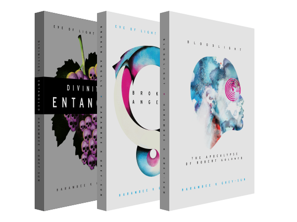
We only set Bloodlight up for ebook, but here's how it might look in print.
Broken Angels
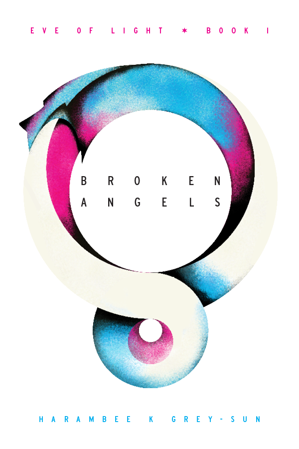
Here's the second book Harambee and I worked together on — the first story in the series proper. I kept it stylistically similar to Bloodlight, but not totally identical.

The oroborous is a pertinant symbol in the book, devouring itself endlessly. It also keys to themes of new (though not always wonderful) beginnings.
I kept the same bright color palette I used for the Bloodlight cover, because light is used within the book in a similar way—but the look is very slightly grimier and darker.
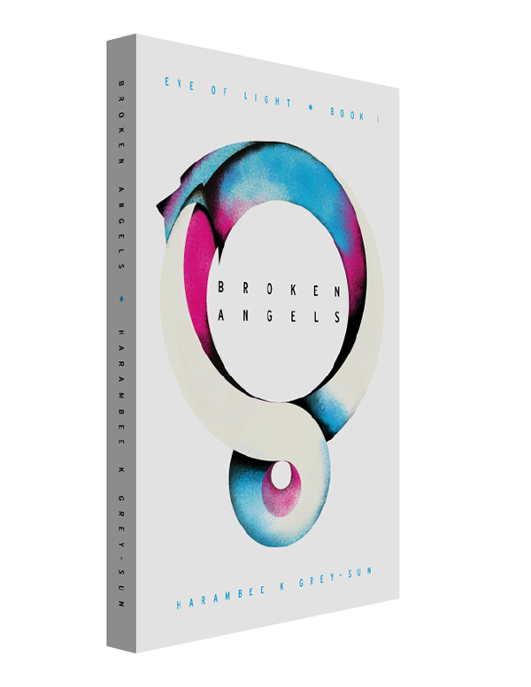
This one was set up for both print and ebook—the print version was published using Createspace. Here's a view of the cover and spine…

…and here's a view of the back cover and spine. The yellow bands are meant to introduce a slightly glitchy element to the look of the book—we'd like each book to look a little more dark and 'off' than the last.
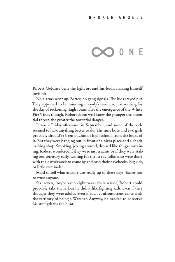
Here's the layout for the book's interior. It's meant to be transparent, placing the story first—but there are a few style elements pulled in from the cover. The typeface fot the chapter head (Interstate) for instance. And the infinity symbol is a visual nod to the oroborous, and fits the same themes that illustration does.
Divinities, Entangled
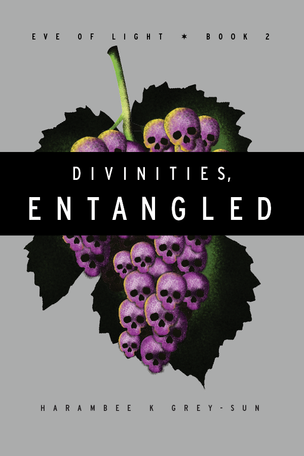
And here's the third book (second in the proper series)—Divinities, Entangled.

Harambee suggested the grapes-as-skulls visual—I did explore some other concepts, but ultimately rolled back to his initial suggestion, which was a strong one. This visual makes a lot of sense toward the end of the book.
Here we pull further away from the very bright colors of the first couple covers, toward more tertiary (and warmer) ones.
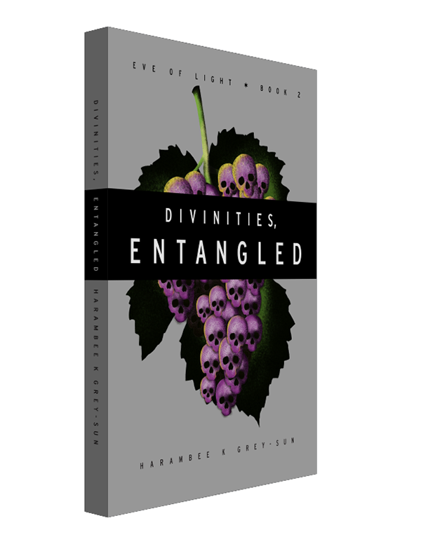
And here it is with the spine. The black band helps the title stand out more, and helps break up the repetition in the skulls. We also used a grey background here, rather than white—we'd like to slowly work our way toward solid black by the series' end.
Whether he’s doing my covers or my interiors, Phillip Gessert never disappoints. In fact, he usually surprises—in a good way. His cover for my book BloodLight took my original idea and punted it into another dimension. I’ve lost count of the number of compliments I’ve received on it—even people who didn’t like the book rave about the cover!
He’s just as good with interiors. How many other designers out there take time to read a book from beginning to end—prose or poetry—then try to find just the right font to match the content and theme?
Incredibly creative in his own right, Phillip is always receptive to the writer’s ideas and gives them the last word—he’s in no way overbearing. Just an overall fantastic designer for writers who want their books to make an impact from first sight to last page.
Harambee K. Grey-Sun
The Author
You can find out more about Harambee at his website, nextpoet.net.